
Case Study: Parcosm
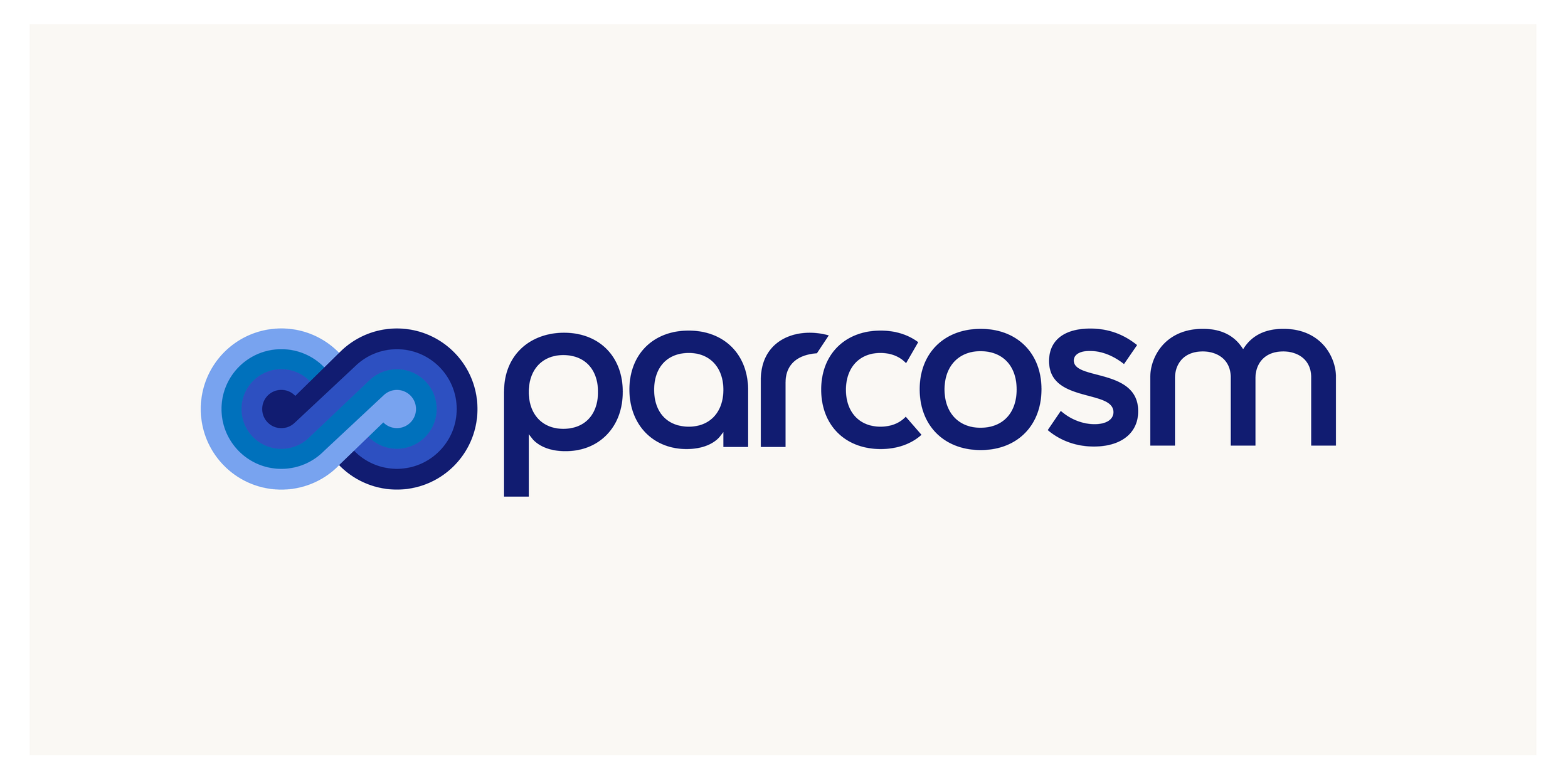
Logo design
Parcosm.ai is an early-stage technology company that makes unstructured data AI-ready. Their platform transforms messy, disparate data sources into structured, usable formats for data scientists and analysts. They work on both sides of the data equation, partnering with vendors to extract and organise their raw data, and serving asset management firms who need that data delivered in a clean, structured format.
The name “Parcosm” reflects the vast scope of their ambition: building what amounts to a digital twin of the physical world, with data on every entity and the relationships between them, growing continuously over time.

Symbol
As a brand-new company, Parcosm had no existing visual identity. They needed a brand built from scratch that could communicate the sophistication and scale of their technology to two very different audiences: Data vendors and institutional investors.
The Parcosm logo centres on an infinity symbol, representing the company’s ever-expanding data bank and engineering capability. The connected letterforms in the wordmark echo the interconnected nature of the entities and relationships within their platform.
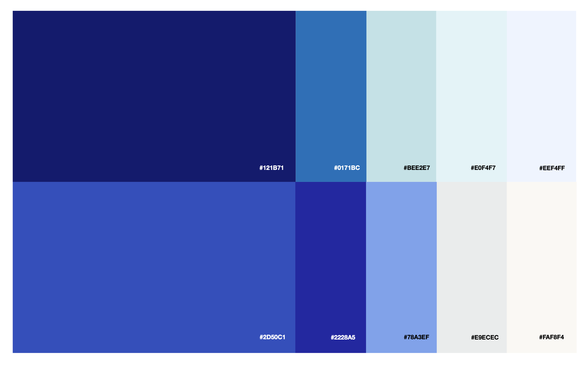
Colour palette
The colour palette is rooted in sophisticated dark blues, conveying depth, trust, and technical rigour, complemented by lighter aqua tones that bring energy and approachability. A carefully selected orange was introduced as a secondary accent, used sparingly to highlight key moments and create visual contrast against the blue system. This dual palette also serves a functional purpose within Parcosm’s materials: the warm tones can represent a problem statement, while the cooler tones signal a solution.
Helvetica Neue was chosen as the typeface for its neutrality, clarity, and precision. These are the qualities that align with a company whose product is fundamentally about making information structured and legible.
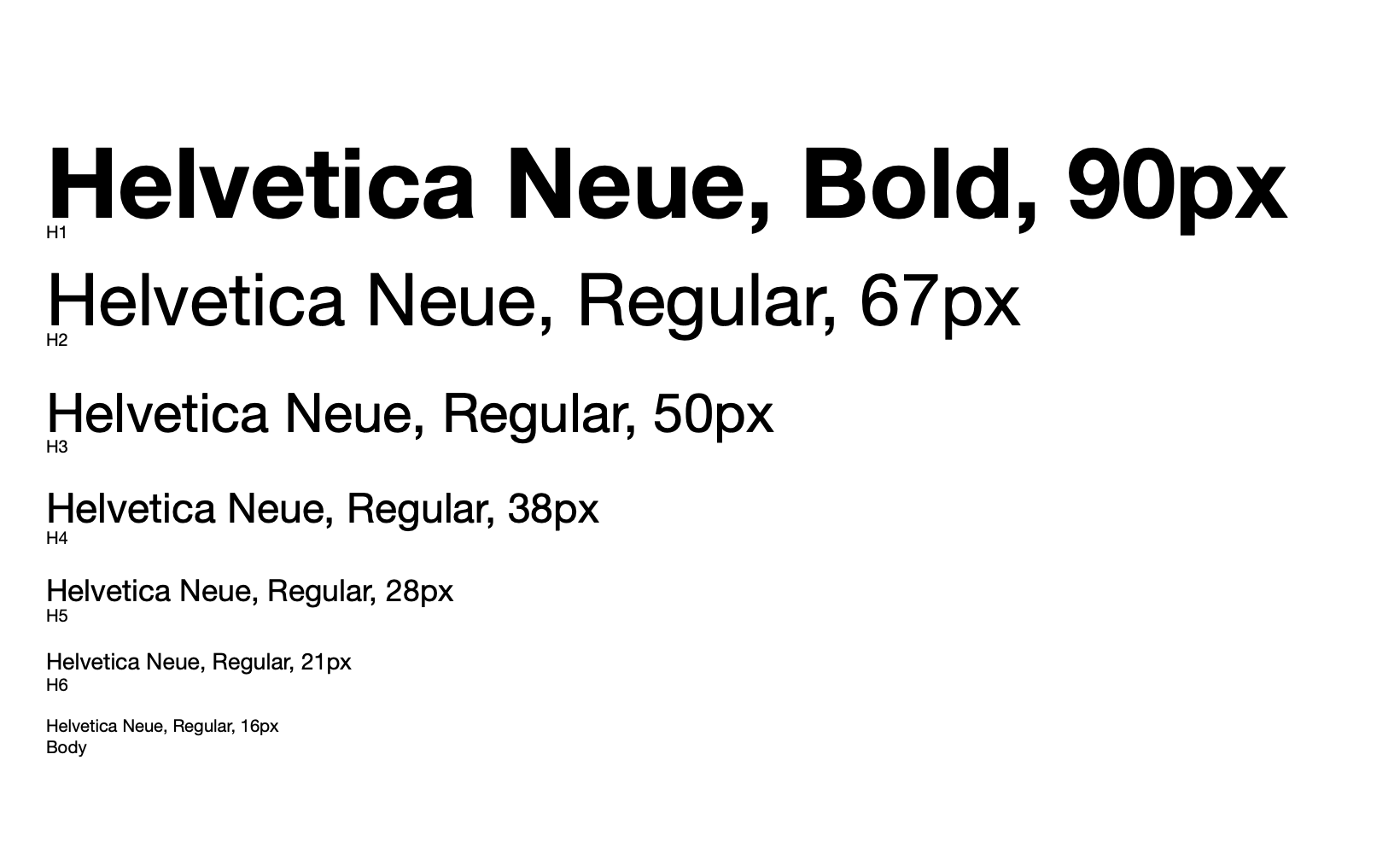
Typeface
A comprehensive brand guidelines document was delivered, covering logo usage rules, clear space requirements, do’s and don’ts, co-branding specifications, the full colour system with hex codes, and typography hierarchy. The guidelines were designed to give Parcosm’s team the tools to maintain brand consistency as the company scales — whether producing internal materials, partnering with vendors, or preparing for events.
Beyond the identity itself, Parcosm needed a polished investor pitch deck that could translate complex data infrastructure concepts into a compelling narrative for pre-seed conversations. The investor pitch deck applied the new brand identity to a structured narrative, translating Parcosm’s data infrastructure story into a clear, visually compelling format. The deck was built to support both live presentations and leave-behind reading, ensuring the brand made a strong impression in fundraising conversations.
The Outcome
Parcosm launched with a cohesive, professional brand that matched the ambition and sophistication of their technology. The identity system gave them the visual credibility needed to engage both data vendors and institutional investors with confidence.
“Raha really worked to understand our specific aesthetic interests and our technology. Through idea and mood boards, we homed in on designs that resonated. With aesthetic decisions, we can be quite demanding. Raha has a very strong eye - it’s evidenced in not just her design work, but her fine art work as well.”
— Brian Peltonen, Founder & CEO, Parcosm.ai