
Case Study: Datapurl

Logo design
Datapurl, launched October 2025, is an alternative data company serving hedge funds and asset management firms with eCommerce price and promo data. It collects publicly available data and organises it into a proprietary category tree, supporting its application for fundamental research and modelling. It has a wealth of data history and is unique in the alternative data market.
The brief for the logo
The name Datapurl was arrived at through two distinct ideas (by the founders).
The first was the image of data being stitched together - purled - alluding to the craft of modelling, and prior to that, developing a coherent system - a category tree and unified field names.
The second was a play on “data per url”, as the product has a granular delivery option, and seeks to cover as much of the worldwide web as possible, with regular expansions over time.
The result
The feeling that the brand has to convey is one of cool stability, support, positivity, and trust.
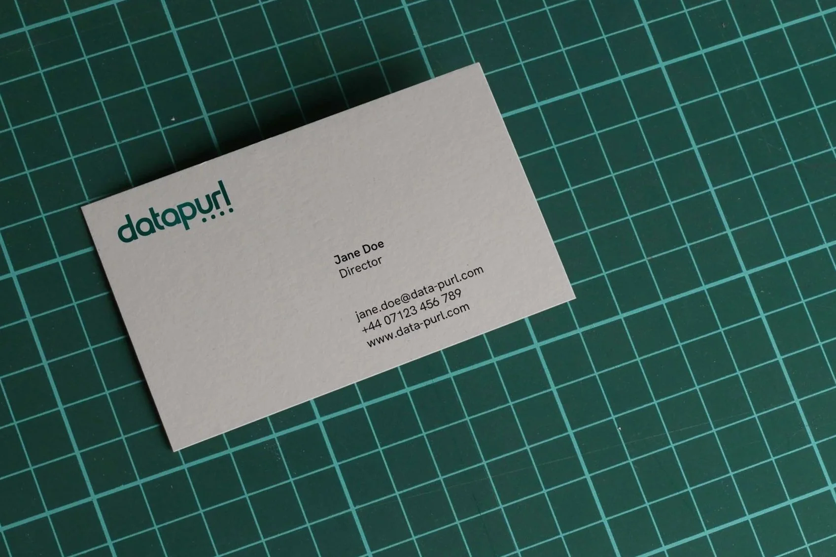
The ‘data per url’ concept was the one that was used for the logo. The inclusion of the dots under the letters url, as well as the subtle gradient darkening those letters, seeks to subtly highlight that meaning of the brand origin story. At the same time, the dots represent a sense of continuity.
The typeface was chosen for its symmetry, optimal readability and curves. It is bold yet professional. The letters are all presented in lower case so as to maintain balance.

Datapurl Style Tile
Datapurl values accuracy and structure - so I chose a font that communicates clarity, order, and rationality. Hanken Grotesk is a sans serif typeface inspired by the classic grotesques. It was chosen for its clean, geometric foundation.
Unlike some ultra-rigid geometric fonts, Hanken Grotesk does incorporate some curves and generous spacing, for a modern and friendly feel. This prevents the brand from feeling overly cold or corporate.
With multiple weights and styles, it has great versatility, and can be applied carefully so as not to overpower data-heavy charts, or code snippets.
After going through several iterations, this shade of green was chosen for its cool confidence, signalling stability and trust.
Green is strongly linked to balance and stability: nature, growth, renewal. Emerald also has historic ties to gemstones, wealth, and rarity. As a brand colour, it suggests a premium, refined offering. Green resonates with growth, progress, flow, analysis, and “go” signals. A deep shade suggests measured intelligence rather than frenetic disruption.
It also holds uniqueness and memorability, as many tech and data brands default to blues - safe, corporate, reliable - whereas this shade of green differentiates Datapurl.
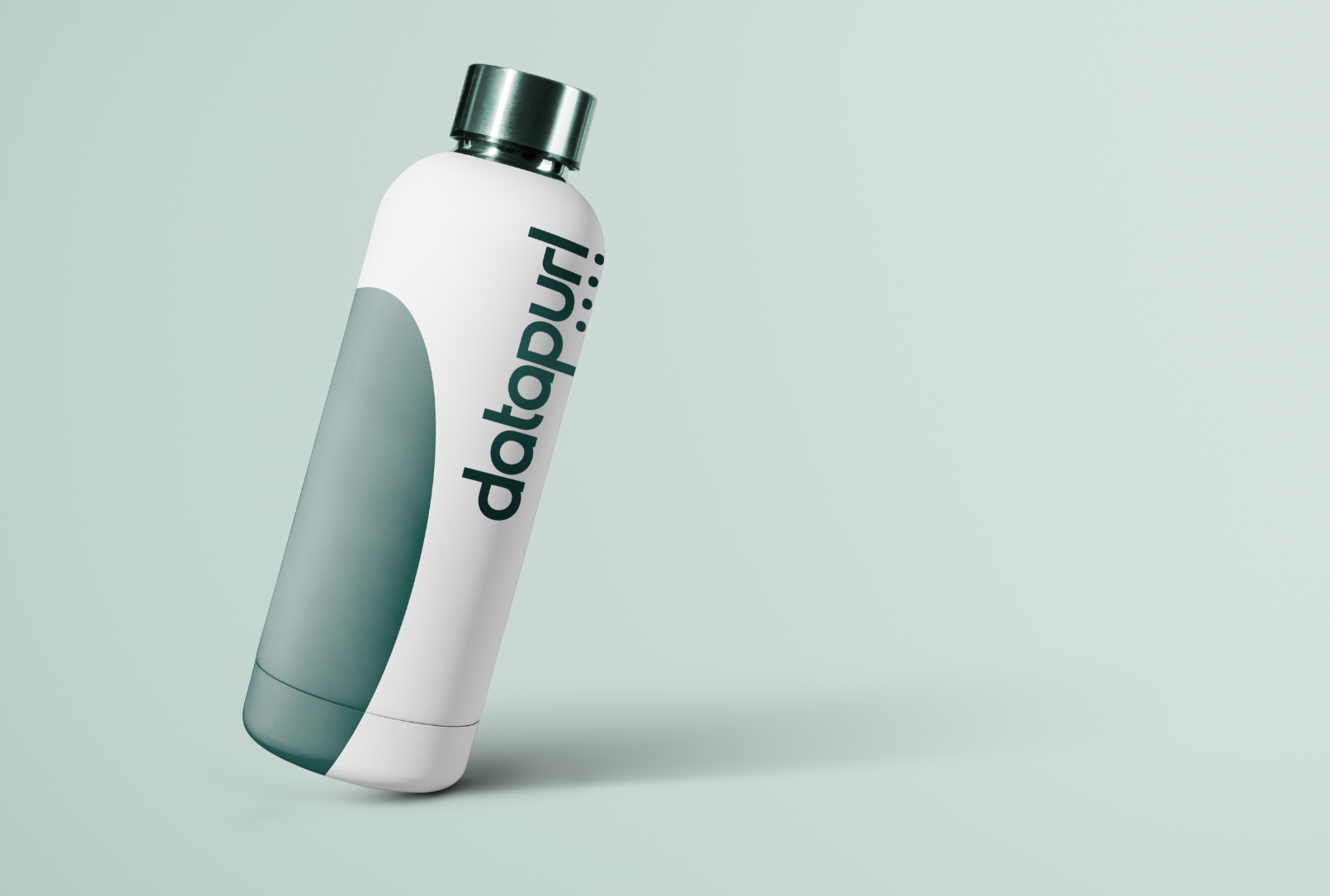
Concepts for conference swag

The company will participate in industry-specific conferences in a sponsorship capacity, so I created concepts for swag.
I arrange for production upon request - unless a client would prefer to deal with merchants directly.
As complementary colours to the cool greens, a couple of orange pink shades were chosen for accent colours, and one of the neutrals has a slightly pink tone - this can be effective in drawing the eye to CTAs or lines in charts - but must be used sparingly.
The Outcome
The Datapurl brand identity came together as a cohesive system rooted in clarity, trust, and quiet confidence, perfectly aligned with a company whose product is built on structure and precision. The logo cleverly encodes the brand's origin story, with subtle dot accents and a gradient shift beneath "url" that nod to the "data per url" concept without overexplaining it.
The choice of Hanken Grotesk as the primary typeface strikes a careful balance between geometric rigor and approachability, ensuring the brand feels professional without becoming sterile - an important quality for a product that lives alongside dense charts and data tables. The deep emerald green palette sets Datapurl apart in a sea of blue-toned competitors, projecting premium stability while the warm orange-pink accents provide just enough energy for calls to action and data highlights. From business cards to conference swag and brochures, the identity extends seamlessly across touchpoints, giving Datapurl a polished, investor-ready presence in the alternative data market.
“When it was time to start a new business from scratch, there was only one person I trusted to collaborate with: Raha. She thinks from the perspective of our audience, and creates exceptional toolkits that help GTM teams tell compelling stories, from pitch decks and product brochures to event flyers and stunning logos. Storyline Lab has been an invaluable partner for Data Purl.”
— James Griffiths, Founder of Data Purl
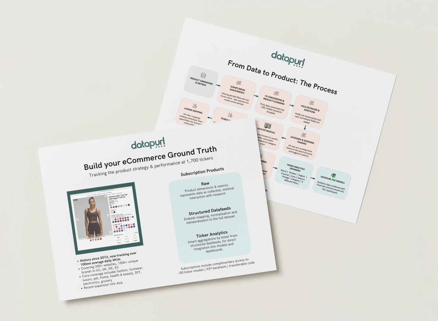
Brochure design